Modern animation systems are being incorporated as a functional element of the application that not only improves the decor but enhances the overall user experience. Using motion and feedback animations inside your UI components is one of the first steps in enhancing the UX.
Flutter being the underlying framework used by FlutterFlow includes Material widgets that come with the standard motion effects defined in their design spec which are also customizable.
This article will help you to get a better understanding of the different types of animations supported by FlutterFlow and which one you should choose depending on your use case.
Envisioning your animation
Before you get started defining your animation, first you should take a moment to think about how your animation looks like.
Is it more like a drawing having a complex movement, or is it just using the layout components having a more subtle animation?
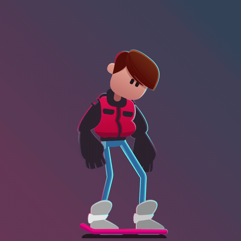
The first animation (left) is quite complex character animation, you can see that it looks like a drawing and not like any traditional UI components used in any mobile app. For creating these types of animation the best tool to opt for is Rive or Lottie which contains the right tools for designing them. You can then directly import the Rive or Lottie asset to your FlutterFlow app for displaying them inside the app.
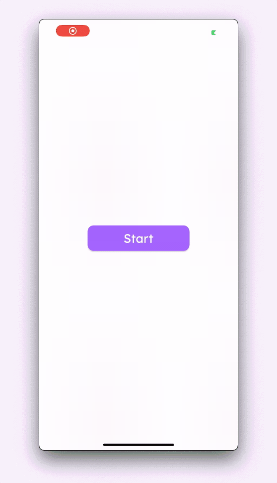
The second animation (right) uses the layout components (known as widgets in Flutter) and adds subtle motion to them for creating a pleasant experience within the app. These types of animation can be created right from the FlutterFlow UI Builder.
We'll discuss both of these types of animations, how to create them, and use them inside your app.
Widget based animation
The layout animations (known as widget animation) can be categorized into two types:
- Implicit animation
- Explicit animation
Some widgets already come with motion animation built in that will work out of the box, these types of animations are known as implicit animations. While using these types of animations you won't need to define the animation curve, duration, or set any trigger to start/stop it.
The animations that you have to define explicitly by specifying the curve, duration, and type of trigger are known as explicit animations. You can set them on various widgets including the ones that already have the implicit animations built-in.
Implicit animation
Let's take a look at some of the ways in which you can take advantage of the implicitly animated widgets using FlutterFlow.
Built-in widget animation
A lot of base widgets have simple motion-based animation built-in as they belong from the Material widget library of Flutter. But a few of the widgets' animation has been made implicit by FlutterFlow so that it's a lot easier to use inside your app.
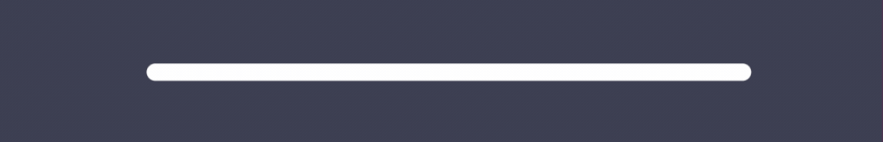
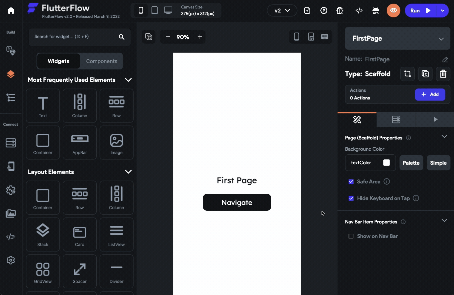
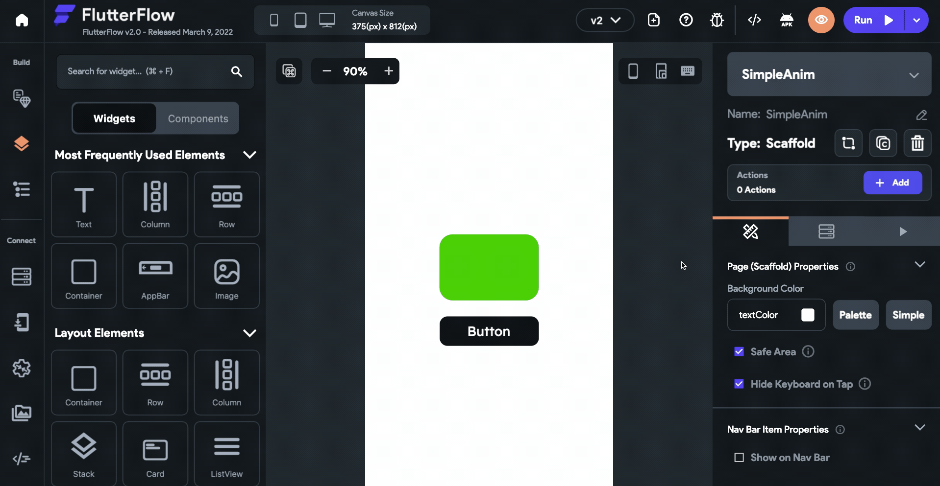
ProgressBar is one of such widgets that can be easily animated with just a single toggle. To use this widget with animation:
- Drag and drop a ProgressBar widget (from the Widget Panel, present on the left) onto the canvas.
- Customize the properties of the widget from the Properties Panel (right menu).
- Check the Animate Progress checkbox. This would animate the progress bar's value as the page loads.
Some more widgets in which you can easily notice the built-in motion animation are BottomSheet, Drawer, and EndDrawer.
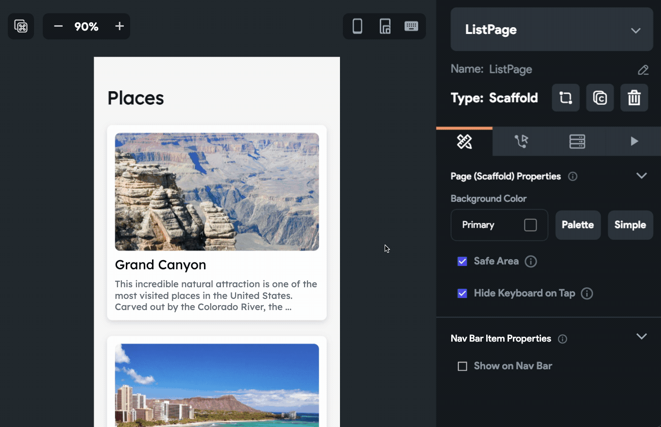
Hero animation
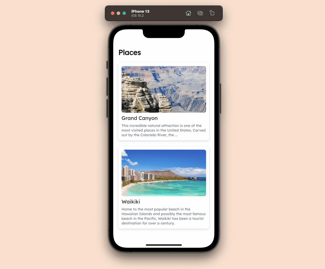
This is a very common animation that you might have noticed a lot of times, an image animating to a different size and flying to another page of the app, it's called Hero animation. Typically, it comes in handy when you have a list of items along with images, and you want to display more information about an item once a user taps on it.
Using this animation inside FlutterFlow is really easy, follow the steps below:
- Select the image present on the first page (which is present maybe inside a list).
- From the Properties Panel, check the Use Hero Animation checkbox.
- Click on the dropdown below Hero Tag (where it's written Unset), click + Add Hero Tag.
- Enter the name of the tag, click Add.
- Now, go to the second page (probably where you have the description of that item), and select the image.
- Again, go to the Properties Panel and check the Use Hero Animation checkbox.
- From the dropdown select the Hero Tag that you have set on the first image.
Loading indicator
When you use any backend query, the result of it usually takes a few moments to arrive. To give a good user experience, a loading indicator (also known as activity indicator) is shown inside the app while it's waiting for the data to arrive. By default, FlutterFlow uses the basic CircularProgressIndicator widget but you can change the animation and use any of the activity indicators provided by the Flutter Spinkit package.
Steps for changing the loading indicator are as follows:
- Go to the Settings and Integrations page from the Navigation Menu (right).
- Under the General section, select App Details.
- From the Loading Indicator section, you can set the type, color, and radius.
Navigation transition
The animation that plays while going from one page of the app to another is known as the navigation transition. While defining a Navigate To Action on any widget, you will notice the transition type is set as Default but you can change that animation easily.
You can choose from any of the following transition animations:
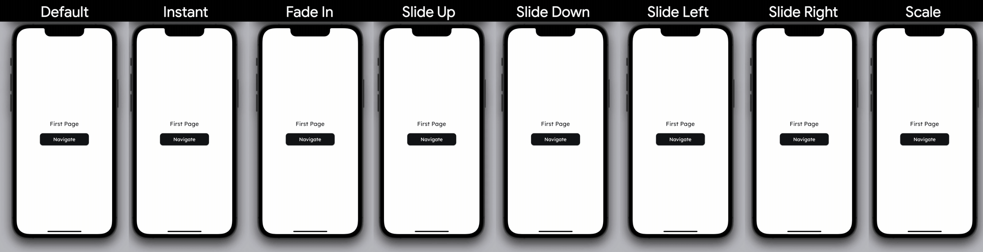
Apply single navigate transition
To set a transition animation for a single navigate action, follow the steps below:
- Select a widget on which you want to set the navigation action.
- From the Properties Panel (right), click on +Add inside the Actions section.
- Make sure you have the On Tap tab selected on top.
- Click + Add Action.
- Set the action as Navigate To and choose the page you want the user to be navigated to from the dropdown.
- To change the transition animation, select an animation from the Transition Type dropdown.
- By default, the animations use 300 milliseconds as the duration for which it plays but you can change it by specifying a value inside the Duration (ms) field.
- Click Close.
Change global navigate transition
To change the default transition animation of your entire app, follow the steps below:
- Go to the Settings and Integrations page from the Navigation Menu (right).
- Under the General section, select App Details.
- In the Navigation Transition section, check Override Default Transition.
- Now, you can set the Transition Type and Duration from here.
- While defining any Navigate To action, use the Default transition type. FlutterFlow will automatically pick up the global transition animation that you have set.
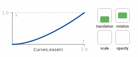
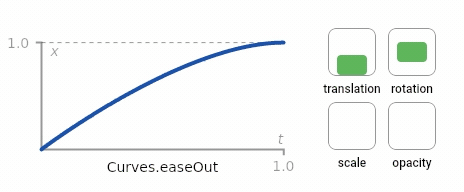
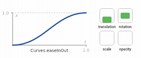
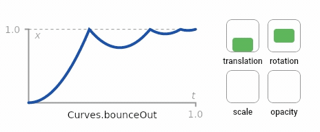
Animation curves
The above section should have given you a pretty good understanding of implicit animations and how easy it is to use them inside FlutterFlow. It's time to move on to the explicit animations, which give you much more control over the behavior of an animation. But before that, you should have a bit of understanding about an important concept called animation curve.
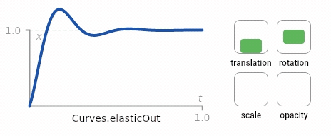
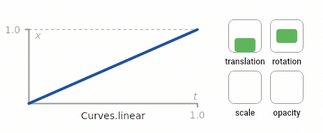
Linear curve is the most basic animation curve that increases a value constantly with respect to time.
Let's take a look at an example of how a linear curve compares to a bounce out curve:
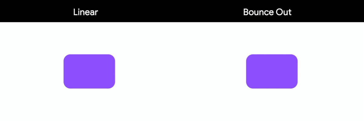
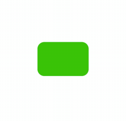
A scale animation is set on a Container widget that scales the size from 1x to 2x:
- Left demo is using a linear curve
- Right demo is using a bounce out curve
Curves can be better understood mathematically by plotting a value with respect to time. But for using them, you don't really need to have any idea about how curves are created because FlutterFlow comes with six of the basic curves built-in:
- Ease In
- Ease Out
- Ease In Out
- Bounce
- Elastic
- Linear
The following visual representation should give you a good overview of how these animation curves look in action:
Explicit animation
Now that you have some knowledge about animation curves, let's dive into the explicit animations.
Types of explicit animations
The basic types of explicit animation that you can use inside FlutterFlow include the following:
- Fade animation: Animates the opacity of a widget from an initial value to a final value to either decrease (fade out) or increase (fade in) the opacity.
- Slide animation: Animates the position of a widget from an initial value to a final value. By changing the position you can slide the widget up, down, right, left, and diagonally.
- Scale animation: Animates the size of a widget from an initial value to a final value to increase (scale up) or decrease (scale down) the size.
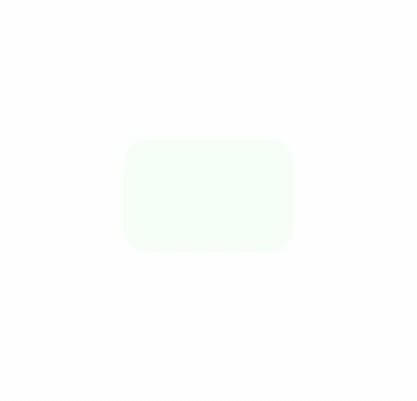
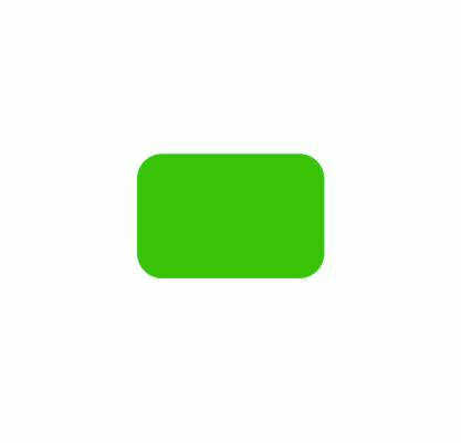
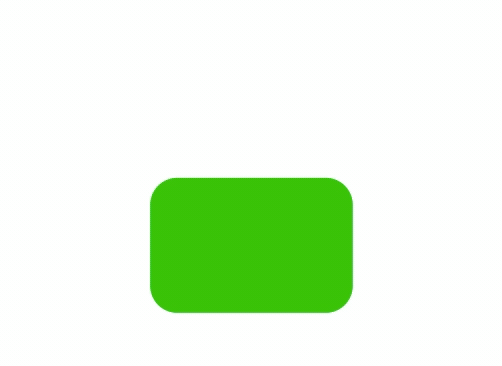
The above animations in action look like this:
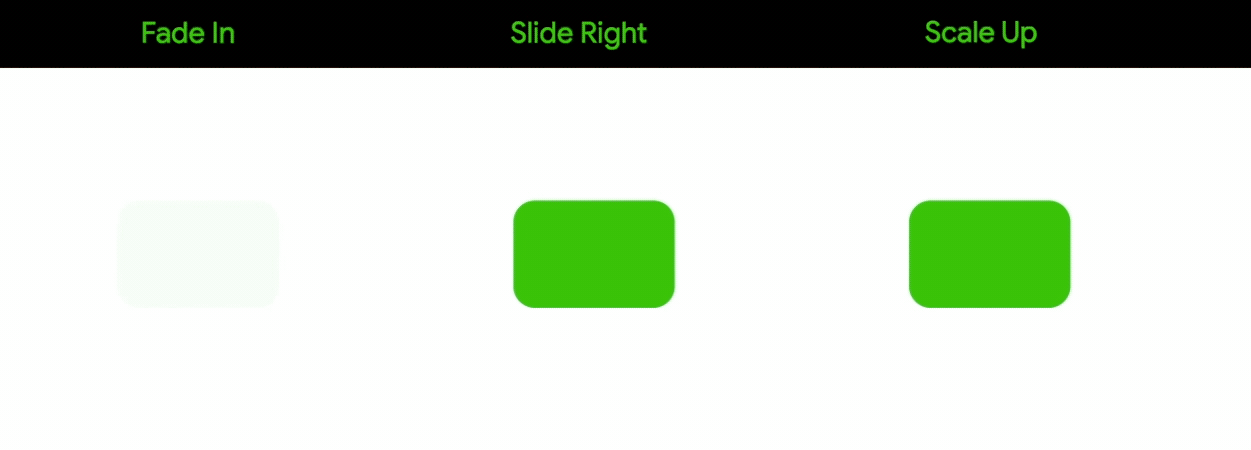
All the animations shown here are using the ease out curve, you can of course use any type of animation curve that we discussed earlier.
Setting animation
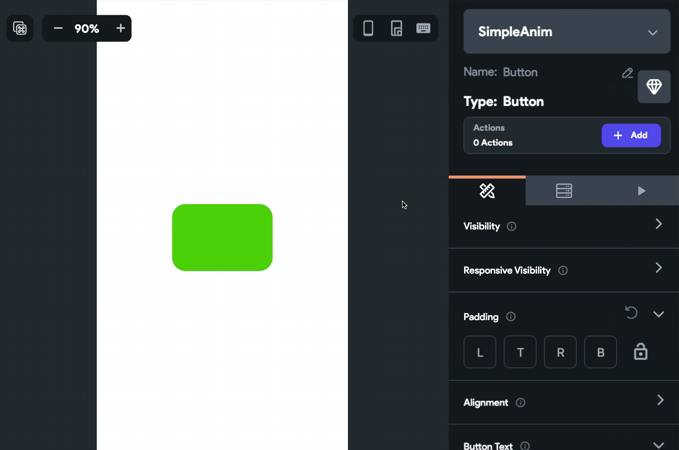
First, let's take a look at the primary steps required for setting an explicit animation on a widget, then we'll look into how to define different types of animation.
Follow these steps to animate a widget:
- Select the widget you want to animate.
- From the Properties Panel (right menu), go to the Animations tab.
- Click + Add Animation.
- Select either On Page Load (animation will start playing as soon as the page loads) or On Action Trigger (animation starts playing only if it's triggered by an action).
- Choose an Animation Curve from the dropdown.
- Set a Duration (time for animating from the initial to the final value) in milliseconds.
- If you want to delay the start of an animation, specify a Delay in milliseconds.
- Under the Animatable Properties section, you can define the type of animation – fade, slide, scale, or combination of these. We'll discuss these in detail in the next section.
- While iterating over an animation, you can use the Preview button to have a quick look at the animation in action. You will also find a Preview All button, it can be used for playing all the animations present on the page together.
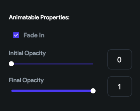
Fade animation
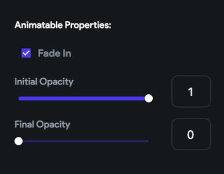
To use the fade animation, check the Fade In checkbox. By default, you will see the Initial Opacity is set to 0 and the Final Opacity is set to 1.
Initially, the widget will be invisible as the opacity is 0, then it will animate to fully opaque as the final opacity is 1.
You can reverse the animation by setting the Initial Opacity to 1 and Final Opacity to 0, this will animate the opacity from a fully opaque to an invisible state.
You can use any fractional value between 0 and 1. For example, you can use 0.5 to set the opacity of the widget to 50%.
Slide animation
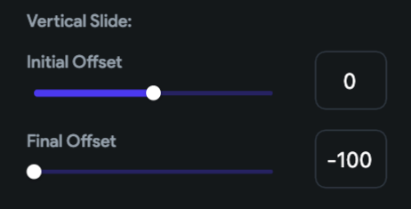
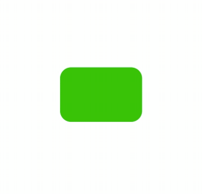
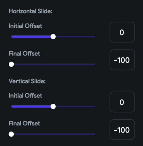
You can change animate the position of a widget to create a sliding animation. Slide animation can be of three types:
- Horizontal Slide
- Vertical Slide
- Diagonal Slide (by combining both horizontal and vertical slide positions)
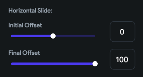
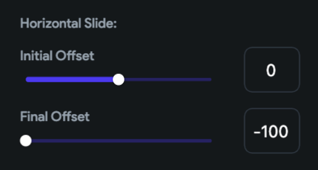
For sliding a widget, offset values are used which are basically set as the number of pixels. If the offset value is 0 that means the widget is in its original position.
Horizontal Offsets: +ve (right), -ve (left)
Vertical Offsets: +ve (downwards), -ve (upwards)
To create a slide animation towards the right, under the Horizontal Slide section, you can set the Initial Offset value to 0 (original position) and the Final Offset to a positive value (for example, 100). This will animate the widget from its original position to the specified horizontal offset value.
Similarly, for animating the position of a widget towards the left, under the Horizontal Slide section, set the Final Offset to a negative value (for example, -100).
For animating the position of the widget downwards, under the Vertical Slide section, set the Final Offset to a positive value (for example, 100).
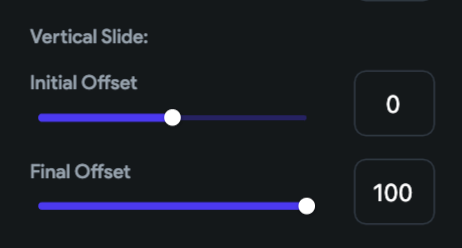
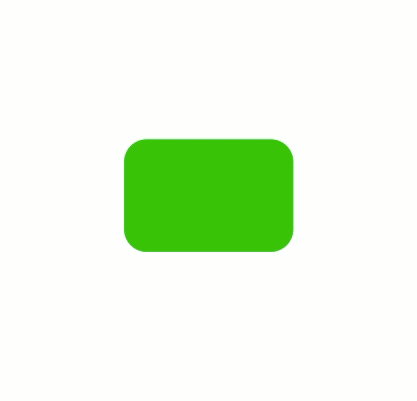
Similarly, to animate the position upwards, under the Vertical Slide section, set the Final Offset to a negative value (for example, -100).
To have a diagonal slide animation, you can use both the horizontal and vertical slide values together.
For example, in order to slide a widget diagonally upwards and towards the left, you have to set the Final Offset of Horizontal Slide to -100 and also the Final Offset of Vertical Slide to -100.
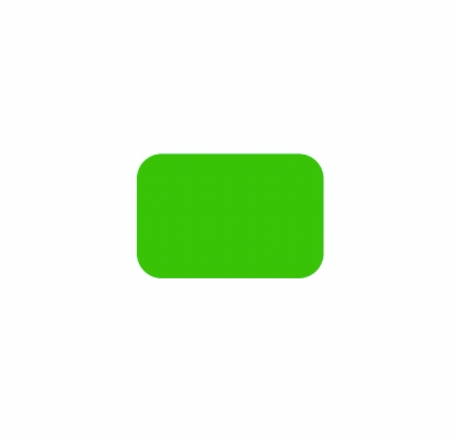
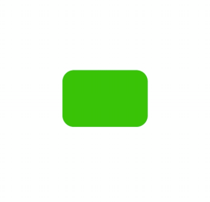
Scale animation
To animate the size of a widget, you can use the scale animation. The scale value 1 indicates the widget is of the original size. Any value higher than 1 would increase the size and any value lower than 1 would decrease the size.
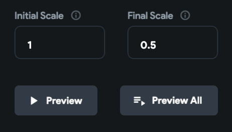
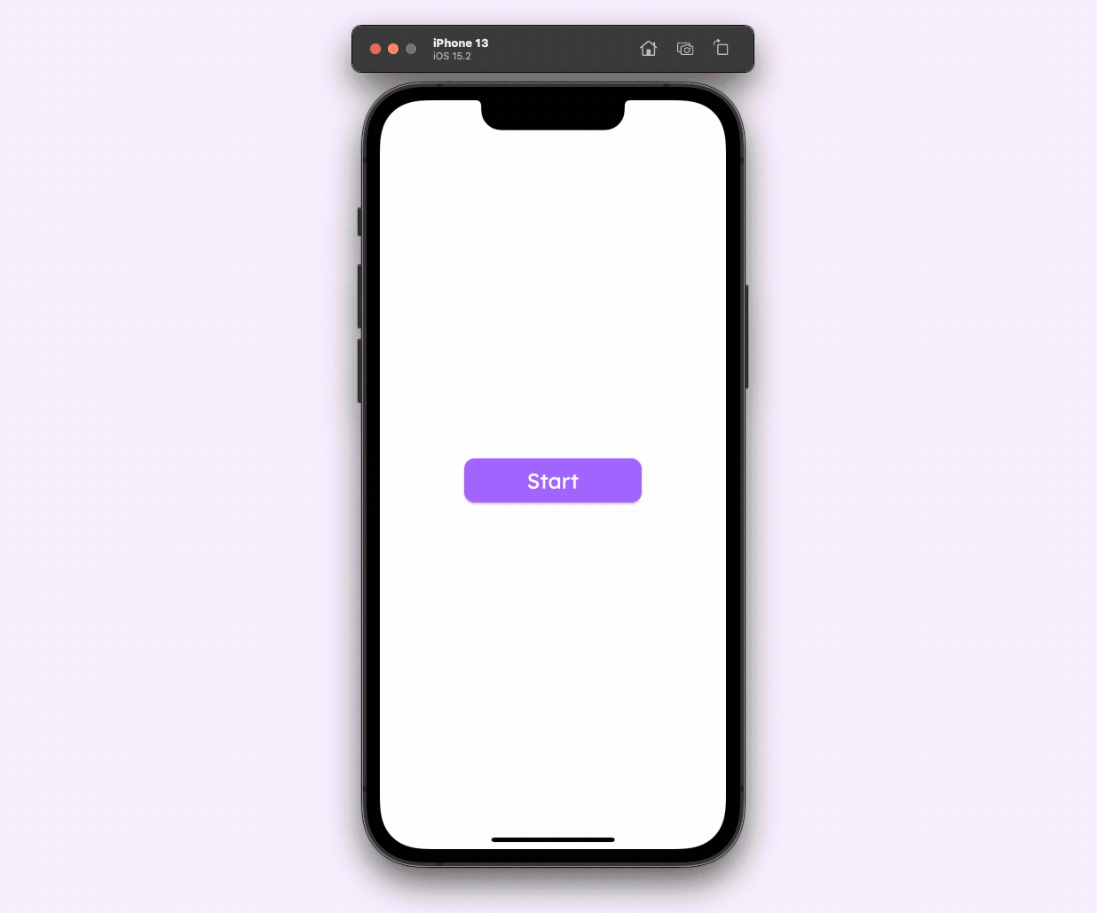
You can do a scale up animation of a widget from its original size to twice it, by setting the Initial Scale to 1 and the Final Scale to 2.
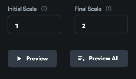
For performing a scale down animation, set the Initial Scale to 1 and the Final Scale to 0.5.
Combining animations
You can combine any of the above types of animation to create an awesome looking animation for your app. Following is an animation that you can easily create by combining different types of animation styles:
Triggering animation using action
On Page Load animations get automatically triggered as soon as the page loads. But if you want to trigger an animation on a button tap, use On Action Trigger while adding an animation.
After you have defined the animation, to trigger it you have to use the Widget Animation Action.
Follow the steps below:
- Select the widget (for example, Button) on which you want to set the action.
- From the Properties Panel (right), click on +Add inside the Actions section.
- Make sure you have the On Tap tab selected on top.
- Click + Add Action.
- Select Widget Animation from the dropdown.
- From the Choose Widget Animation dropdown, select the widget containing the animation. If you have given a specific name to the widget that would show up here.
- Click Close.
Now, the animation will only start if you tap on the widget containing the action.
Rive animation
Rive is a real-time interactive animation tool that lets you create complex designs using their web-based editor and easily import them inside your app as assets. To start creating your animation, you can head over to the Rive Editor.
We won't go deep into how to create Rive animations in this article but we'll take a look at how to use a Rive asset inside your FlutterFlow app.
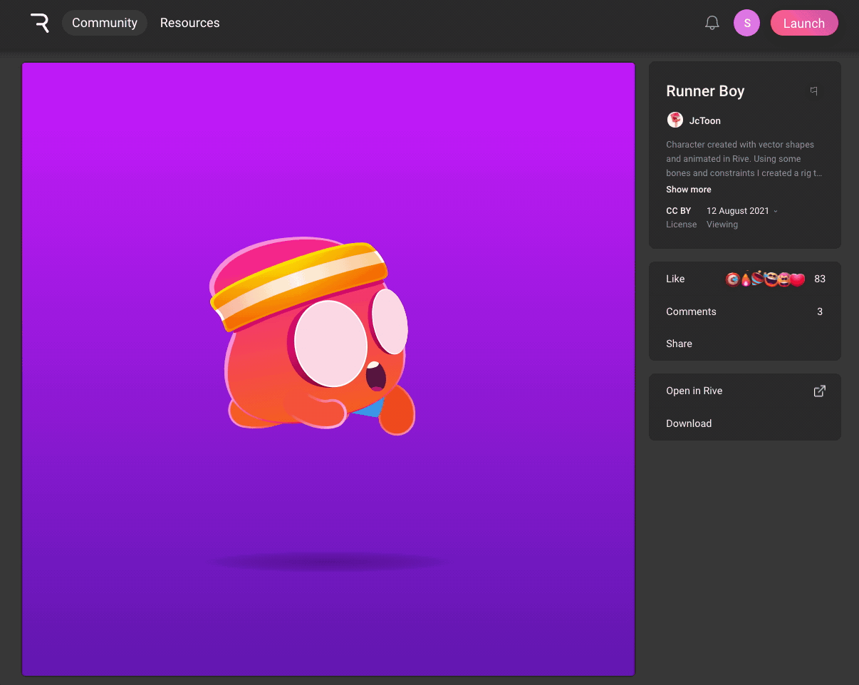
There is a community maintained by Rive, filled with awesome creations that you can import and try out inside your app.
Today, we'll try to import the following Rive asset (created by JcToon) inside a FlutterFlow app:
Follow the steps below:
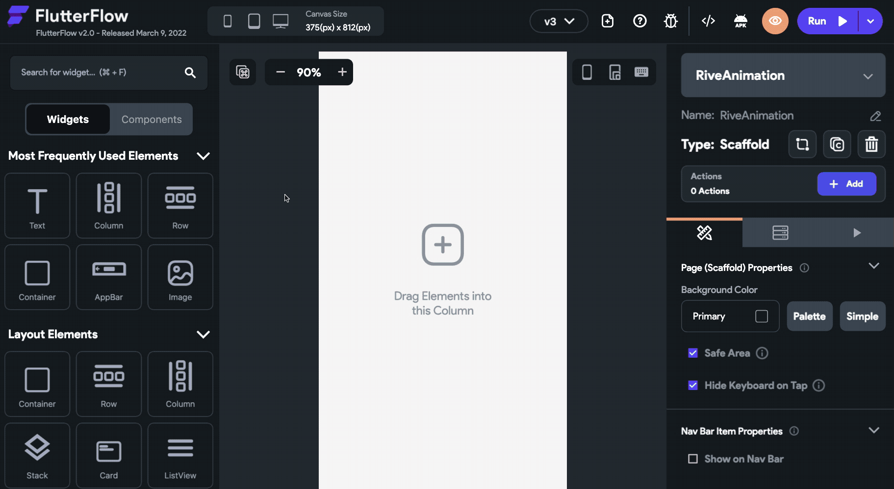
- Drag and drop the RiveAnimation widget onto the canvas.
- You can access a Rive file either by providing its URL (to get this URL the animation should be published to the Rive community) or by uploading it as an asset. Select the Animation Source either as Network or Asset accordingly.
- If you have selected Network, enter the Path (download URL) of the animation. Get the path by navigating to the Rive animation published in the community, right-click on the Download button and copy the link address.
- If you have selected Asset, click the Upload RiveAnimation button and choose the Rive asset file.
- Choose an Artboard from the dropdown list, by default the Rive animations have an artboard named "New Artboard".
- Under Animations, choose the animation that you want to apply. In this animation, the name is itself "Animation". You can click on Preview Animations to see the selected animations in action.
- The Animation Type is selected as Once by default. If the selected animations contain a loop or boomerang, you will have an option to select Continuous. On choosing this option, if the animation contains a loop it will play continuously.
- Make sure the Auto Animate checkbox is checked, meaning that the animation will start playing as soon as the page loads.
- Specify the Width and Height of the RiveAnimation widget either in pixels or in percentage.
- Select a Box Fit type, here we'll choose it as Contain.
Triggering using Action
To start a Rive animation using action, make sure you have unchecked the Auto Animate checkbox.
For defining the action, follow the steps below:
- Select the widget (for example, Button) on which you want to set the action.
- From the Properties Panel (right), click on +Add inside the Actions section.
- Make sure you have the On Tap tab selected on top.
- Click + Add Action.
- Select Rive Animation from the dropdown.
- From the Choose Rive Animation dropdown, select the RiveAnimation widget. If you have given a specific name to the widget that would show up here.
- You can check the Allow Play/Pause checkbox if you want the button to be able to both start and stop the animation, otherwise, it will just start the animation.
- Click Close.
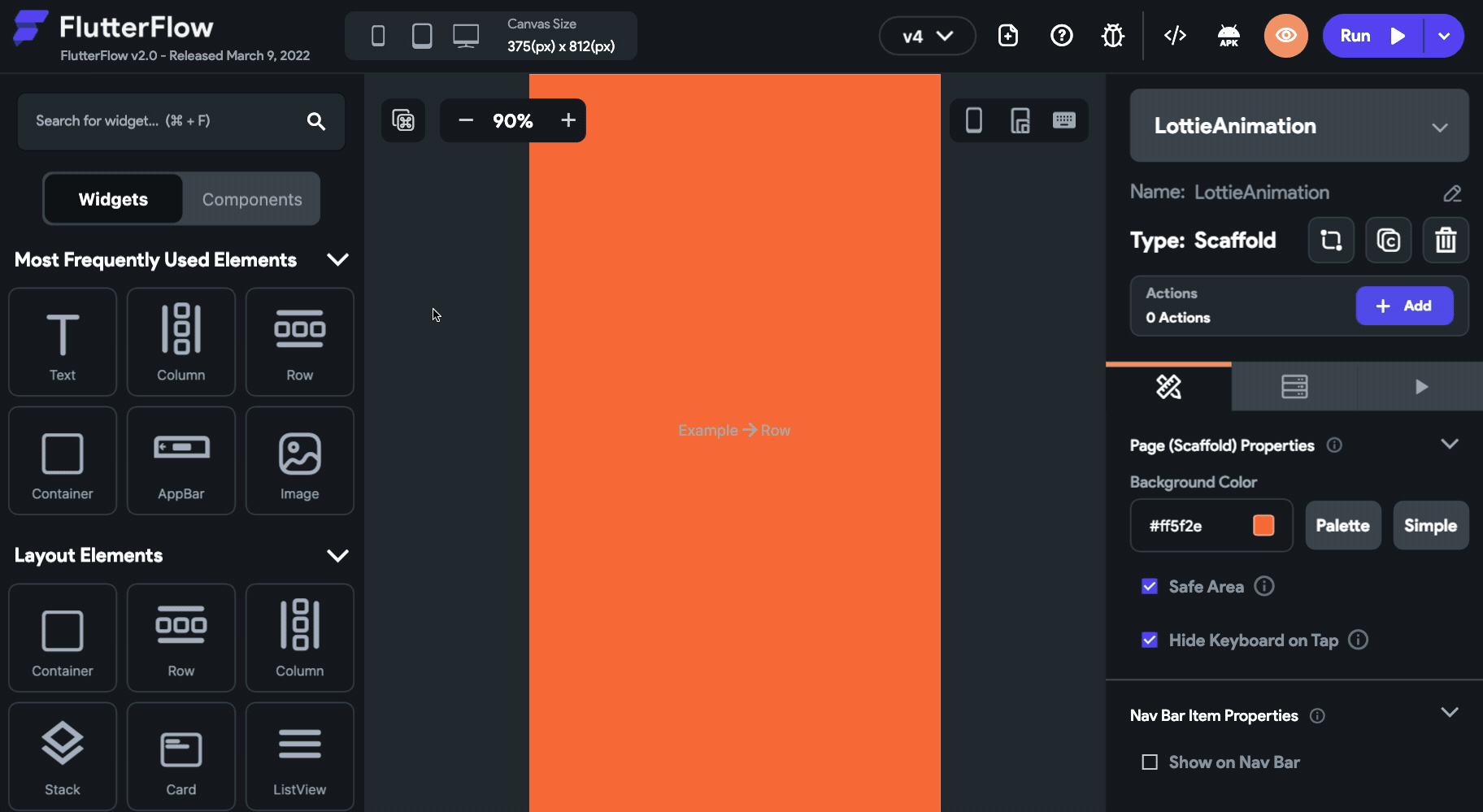
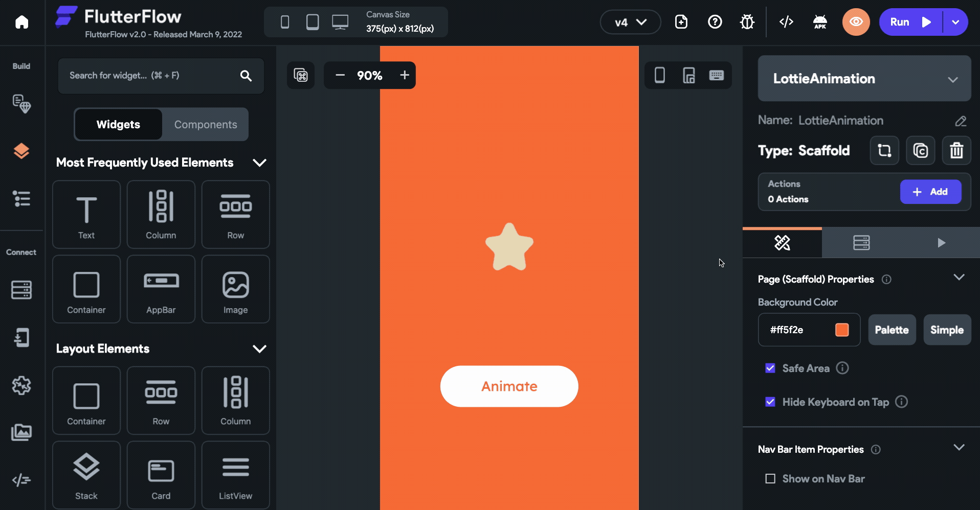
Lottie animation
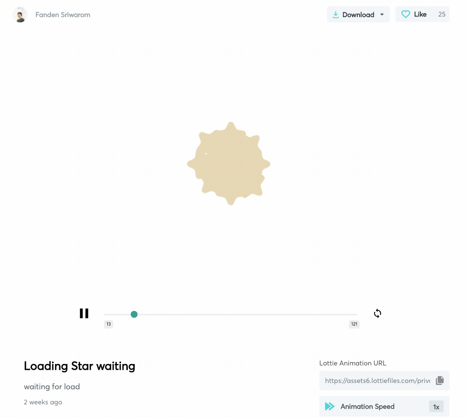
Lottie is another tool for designing lightweight animations that you can import to your app. LottieFiles are generally created using its plugin for Adobe After Effects which you can then customize using their online editor as well.
They also have a community page containing a collection of free Lottie animation assets that you can try out in your app. Today, we'll be using the following Lottie asset in the app (created by Fanden Sriwarom):
Follow the steps below to use Lottie assets inside your FlutterFlow app:
- Drag and drop the LottieAnimation widget onto the canvas.
- Select the Animation Source either as Network or Asset.
- If you have selected Network, enter the Path (URL) of the animation. Get the path by navigating to the Lottie animation published in the community and copy the Lottie Animation URL.
- If you have selected Asset, click the Upload LottieAnimation button and choose the Lottie asset file.
- Check the Auto Animate checkbox so that the animation will start playing as soon as the page loads.
- Select an Animation Type from the dropdown among – Once, Loop, and Boomerang.
- By default, there isn't any Frame Rate specified which means the animation plays at the original speed (which is 60 frames/second). But if you want to reduce the speed you can set the frame rate to less than 60 and similarly for increasing the speed set the frame rate to greater than 60.
- Specify the Width and Height of the LottieAnimation widget either in pixels or in percentage.
- Select a Box Fit type, here we'll choose it as Contain.
Triggering using Action
To start a Lottie animation using action, make sure you have unchecked the Auto Animate checkbox.
For defining the action, follow the steps below:
- Select the widget (for example, Button) on which you want to set the action.
- From the Properties Panel (right), click on +Add inside the Actions section.
- Make sure you have the On Tap tab selected on top.
- Click + Add Action.
- Select Lottie Animation from the dropdown.
- From the Choose Lottie Animation dropdown, select the LottieAnimation widget. If you have given a specific name to the widget that would show up here.
- You can check the Allow Play/Pause checkbox if you want the button to be able to both start and stop the animation, otherwise, it will just start the animation.
- Click Close.
Conclusion
Though animation makes the user experience of the app a lot better, generally, adding animations to an app is a time-consuming and tedious process. But with the help of built-in animation tools inside FlutterFlow, you can create amazing looking animations in just a few minutes and preview them quickly while iterating over the design. For drawing-based animations don't forget to take the help of powerful tools like Rive and Lottie.
Feel free to share your FlutterFlow app animations on Twitter (by tagging @flutterflow) and LinkedIn with the hashtag #builtwithflutterflow.