When building apps, many teams run into the same problem: the same elements get rebuilt multiple times. A login form here, a card design there, a button that looks just slightly different depending on who built it. Over time, this slows down development and creates inconsistencies in the user experience.
FlutterFlow’s Components feature solves this by letting you turn any widget or group of widgets into a reusable building block. Once created, a component can be dropped into any page of your app, customized with parameters, and updated in one place so changes cascade everywhere it is used.
For startups, this means moving faster without reinventing the wheel. For agencies, it means delivering consistent results across multiple client projects.
What You Can Do With Components
Components are not just shortcuts. They are powerful tools for maintaining design consistency, improving collaboration, and reducing errors. Here are a few common uses:
- Shared UI elements: Create a standard header, footer, or navigation bar once and reuse it across your app.
- Forms and inputs: Build a login form, contact form, or checkout field set as a component so they are consistent wherever used.
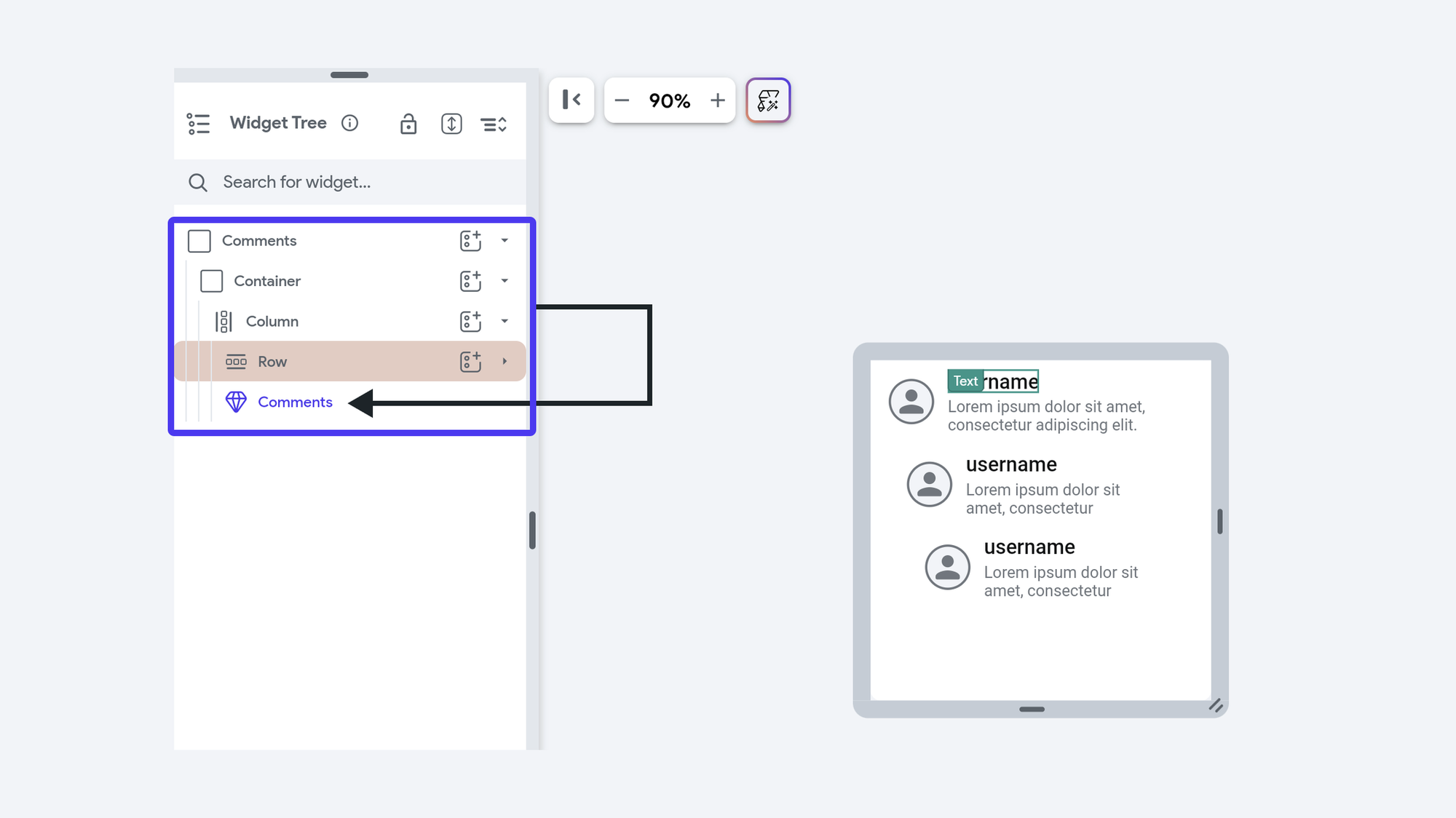
- Cards and lists: Package up product cards, user profile tiles, or content previews as components that can be dropped into multiple screens.
- Custom interactions: Add built-in actions or animations so that every instance of the component behaves the same way.
By thinking of components as your personal design system, you can scale apps with fewer inconsistencies and less rework.
How to Create and Use Components
Creating a component in FlutterFlow is simple:
- Select widgets: Highlight one or more widgets you want to turn into a component.
- Convert to component: Use the “Create Component” option, give it a name, and save.
- Reuse: The component now appears in your widget panel and can be added anywhere in your project.
- Customize: Add parameters so each instance of the component can accept input values such as text labels, icons, or callback actions.
Once created, components behave just like widgets. You can bind them to data, animate them, or nest them inside other components.
Docs: Using Components in FlutterFlow
Best Practices for Components
To get the most value out of components, it helps to follow a few best practices:
- Think ahead: Build components for patterns you know you will reuse, like buttons, forms, or modals.
- Use parameters: Expose variables such as text, colors, or actions so the component can adapt without needing separate versions.
- Document clearly: Add descriptions inside the component so teammates know its purpose and how to use it.
- Combine with Libraries: For larger teams or agencies, package components into a Library so they can be reused across multiple projects.
- Keep it simple: Avoid making components so complex that they are harder to manage than the widgets they contain.
Real-World Examples
- A startup builds an onboarding flow with several screens. By making each screen a component, they can reuse it in different branded apps with minimal tweaks.
- An agency creates a Library of UI components such as nav bars, product cards, and checkout forms. Every new client project starts with these components, cutting delivery time dramatically.
- A dev team working on a marketplace app uses components to standardize how items are displayed. When the design changes, they only update the component once and every screen updates automatically.
Bringing It Together
Components in FlutterFlow are more than convenience features. They are a way to bring consistency, speed, and collaboration into your app-building process. By creating reusable building blocks, you save time, reduce errors, and ensure that every part of your app feels like it belongs together.
Whether you are a startup racing to launch an MVP or an agency juggling multiple client apps, making the most of components can be the difference between a project that drags on and one that delivers quickly with confidence.