One of the things almost everyone of you might have faced at least once while designing any user interface of an app is the overflow issue. It can cause certain UI elements of the app not to render as expected on the device screen and might have clipping issues.
Today, we will discuss more about the overflow issue - how you can identify if there's an overflow and finally fix it so that the layout design is consistent across different screen sizes.
Let's start by having a better understanding of what exactly is an overflow and why it even occurs in the first place.
What's Widget Overflow
In simple terms, an overflow issue is caused when you place a widget onto the canvas that can't fit in the available space (either along the width, height, or both).
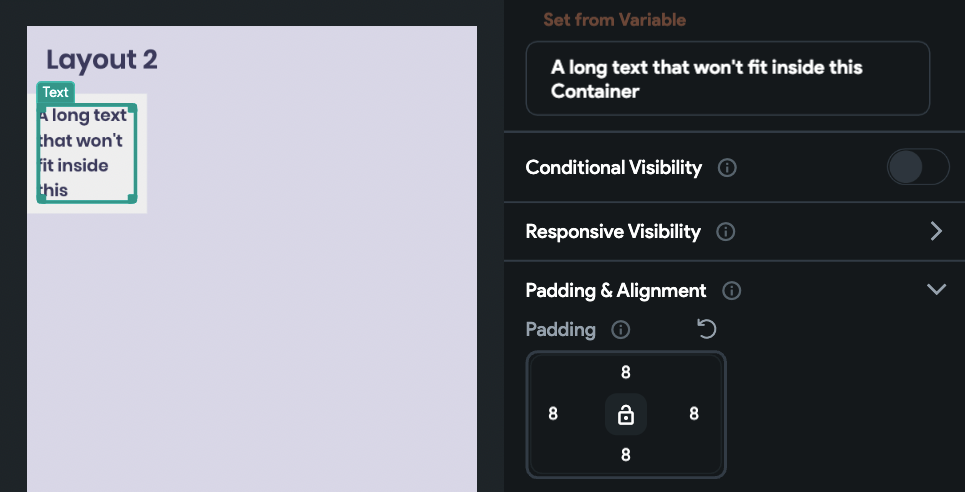
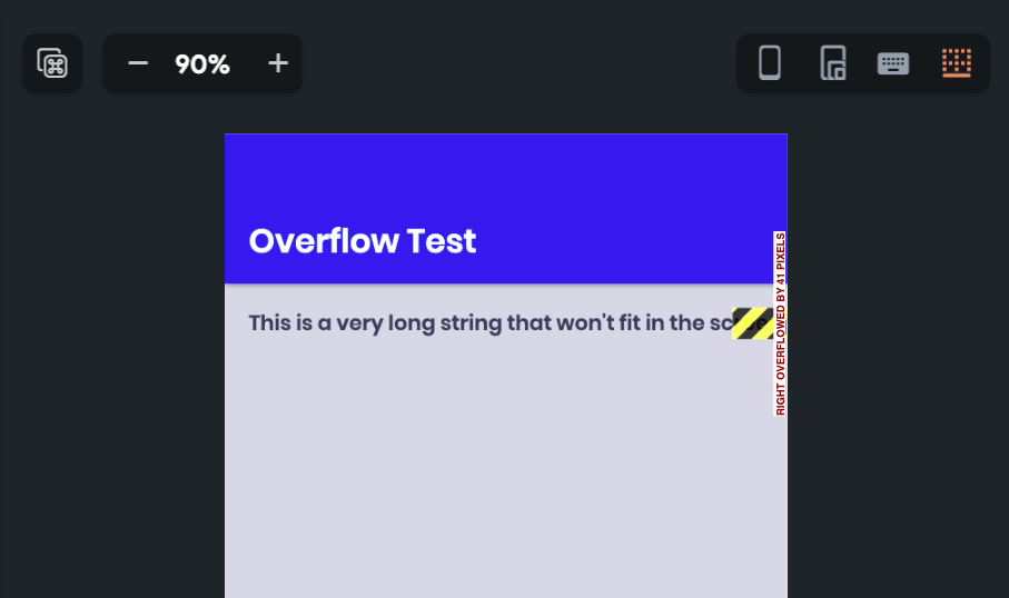
The following demonstration shows an overflow issue caused by a Text widget containing a long text placed inside a Row.
Commonly, this issue occurs when a Column or Row has a child widget that is not constrained to its size (the child causes the overflow issue). In the above example as well, you see a similar overflow issue where the Text widget present inside a Row is overflowing.
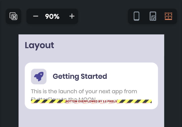
Getting Started
To understand how you can avoid layout overflows, you first need to face them. So, the best way to get started is by building a simple layout.
Let's build a layout having the following Getting Started UI element:

If you are familiar with designing layouts using FlutterFlow, this UI element should look quite simple to build at first glance. But still, there are a lot of ways to get it wrong.
A demonstration of building this element is below:
There's an overflow issue present!
We have specified a fixed height to the Container widget that's wrapping a Column containing differently sized children - this is a BAD PRACTISE. In this case, we just want the Container to wrap the entire Column. For that, you don't need to specify a fixed height.
We'll have a look at the solution in a bit.
But before that - how would you understand if there's any overflow issue in the layout? You surely can, if you know what to look for 😉.
Finding Overflow Issues
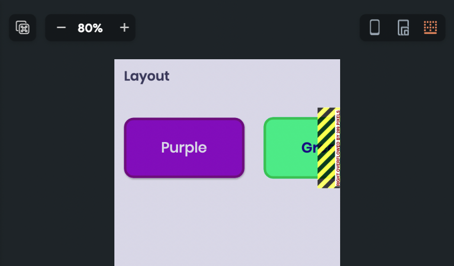
If you have seen the above demonstration with a keen eye, you might have noticed a new button appear in the top-right corner of the canvas area. It's called the Show Overflows button, and by clicking it, you will be able to see the specific areas where the layout overflow issues have occurred.
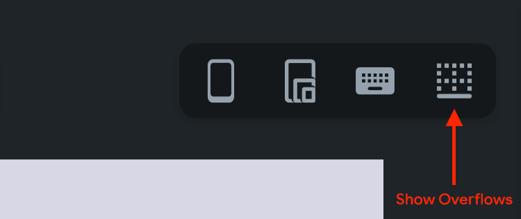
Once you click on this button, the edges of the overflowing widgets will be marked with a yellow and black striped pattern along with a message.
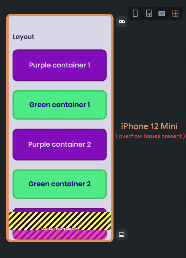
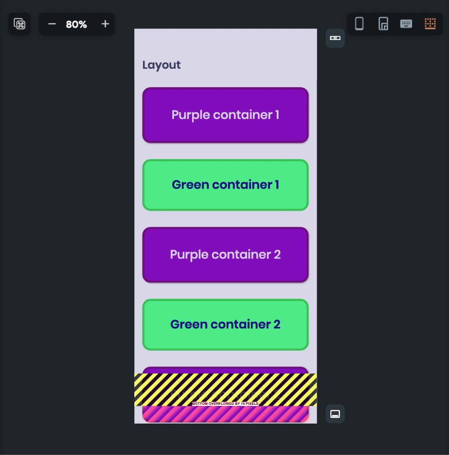
There might be certain overflow issues that are not this easy to spot. Let's have a look at an example.
In the following layout, we have added a bunch of Containers (purple and neon green) inside a Column (non-scrollable).
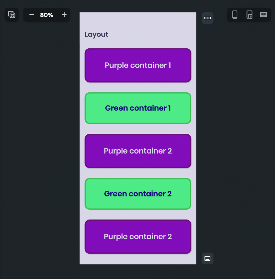
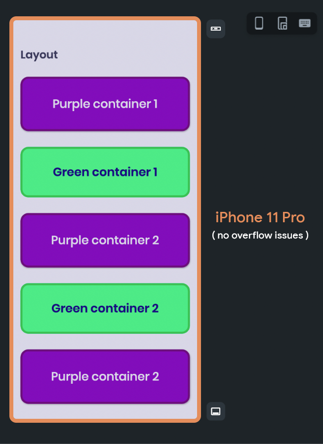
The layout looks completely fine when we have the iPhone 11 Pro device selected but if a smaller screen size device is selected (such as iPhone 12 Mini), the layout overflows from the bottom.
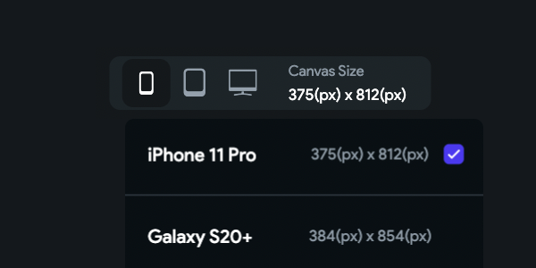
To choose the canvas size according to a device screen size, go to the Canvas Size section (present in the top-left of the screen inside the Tool Bar). You will find three types of device sizes (mobile, tablet, and desktop); click on the mobile icon, and select a device from the list.
Instead of cycling through the different devices from the list, there's an even better way to check if your layout is adaptive to different screen sizes. Select the Display Resize Handle Bars button and resize the canvas to different sizes to check if any overflow issues occur.
You will learn to prevent these layout overflow issues in the further sections of this article.
Container Overflow
This is one of the most common types of overflow issues you might be facing if you are new to FlutterFlow's layout building technique.
As you might already know, FlutterFlow uses the Flutter framework for code generation, and most of the widgets you get here are basically Flutter widgets. Here, we will try to understand certain concepts that come from the foundational properties of the Container widget in Flutter and use them to avoid layout overflows.
When you add a child inside a Container, it tends to wrap the child and adapt the Container size according to the child widget.
To fix the overflow issue in the Getting Started UI element, just remove the specified height value from the Container wrapping the Column of the element.
For a better understanding, let's have a look at how the Container adapts its size according to the child widget in different scenarios.
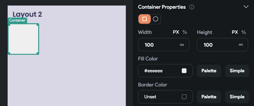
When you drag a new Container widget onto the canvas, by default, it has a height and width of 100 pixels.
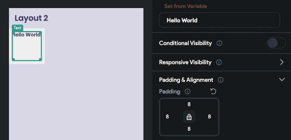
Let's add a Text widget inside the Container.
If it's a long text that can't fit inside the specified dimensions of the Container, the text will get cropped off.
There are various ways in which you can adapt the Container to the child widget (in this case, the Text widget) present inside it, depending upon your use case.
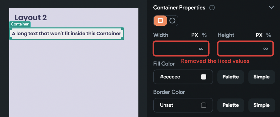
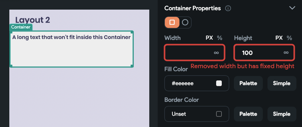
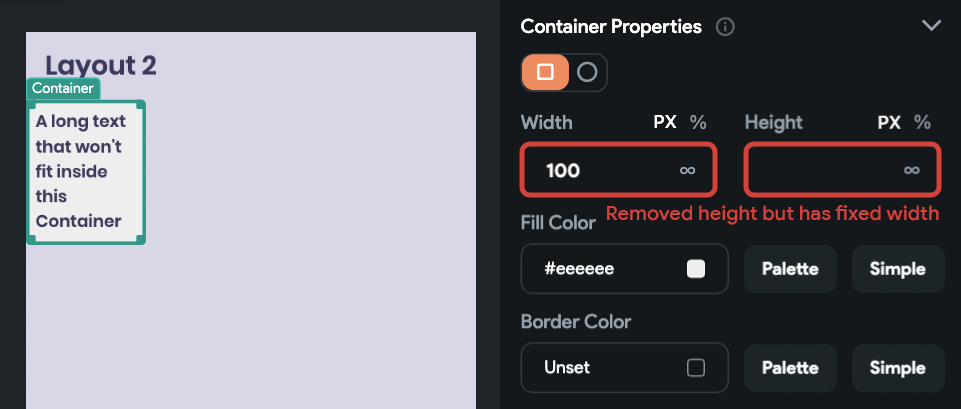
We have used a Text widget to demonstrate the various scenarios here, but it would be similar if you use any other widget as the Container's child.
Text Overflow
Typically, overflow of the Text widget occurs if it's placed inside a Row either alone or along with any other widget. This happens because the text wants to expand horizontally but doesn't know how to constrain itself inside the boundaries of the Row.
There's an easy way to fix this Text overflow issue!
Just make the Text widget Expanded.
Making a widget expanded, let's it fill the available space along the main axis (e.g., horizontally for a Row or vertically for a Column). So, when you make the Text widget expanded, it takes up the entire available horizontal space inside the Row and wraps the rest of the text to a new line.
To make the Text widget expanded, select the widget, and from the Properties Panel choose the second icon beside Expansion.
This would prevent the overflow issue and soft wrap the entire text.
But in some cases, you might want to restrict the text to a specified number of lines. For example, you might want to show a list of books with varying lengths of description, but let's say you want to restrict the descriptions to just two lines to keep the UI consistent and clean. You can do it using the Max Lines property.
Column and Row Overflow
The Column widget's size is determined by the children present inside it. If the children tend to take up more vertical space (i.e., along the Column's main axis) than the device's screen height, it would cause an overflow issue.
Similarly, the Row widget's size is also determined by the children present inside it. In this case, if the children tend to take up more horizontal space (i.e., along the Row's main axis) than the device's screen width, it would cause an overflow issue.
Both these overflow issues can be fixed by making the Column or Row widget Scrollable. Select the Column/Row widget, go to the Properties Panel, and select the Allow scrolling button.
Alternatively, you can also use the ListView widget which has scrolling enabled by default, and you can choose the Axis to be either vertical or horizontal.
There's another advantage of using this widget over a scrollable Column/Row widget. When you are showing a dynamic list of items (which is quite long), ListView only renders the visible items on the screen instead of loading everything at once - which helps in better performance and less memory consumption.
In some cases, making Column or Row scrollable might not be ideal. Let's look at how you can prevent overflow issues in a non-scrollable Column/Row widget.
Usually, these types of overflows occur due to fixed values of Padding around widgets. For example, let's say we want to build the following layout:
The space above the Get Started button can be given just by adding a top padding to the widget. But wait, specifying a fixed amount of padding is a BAD PRACTISE as it won't push the button down enough on devices with taller screens and might cause an overflow issue on devices with less-tall screens.
The proper way of adding space above the button is using a Spacer widget. It is one of the most underrated widgets, but it's one of the most useful widgets to insert a flexible empty space between two children of a Column or Row.
There are certain advanced ways of using some flexible widgets like Spacer. We will look at these in-depth in the next.
Enhancing Adaptability
Preventing layout overflow is all about making your layouts more adaptive and dynamic. One of the advanced properties that help to increase adaptability is called Flex.
Flex (or, flex factor) is an integer value that helps to determine the proportion of the available space that should be assigned to each of the widgets inside a Row or Column widget.
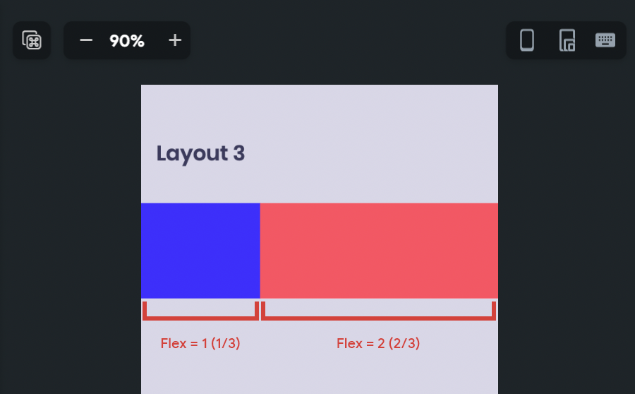
By default, when you make multiple widgets expanded inside a Row or Column, each has a Flex value of " 1 " (i.e., all of them will be equally sized).
Now, let's define the BlueContainer's flex value as " 1 " and the PinkContainer's flex value as " 2 ". This will assign 1/3 of the space to the BlueContainer and 2/3 of the space to the PinkContainer.
You can also use flex factor with the Spacer widget.
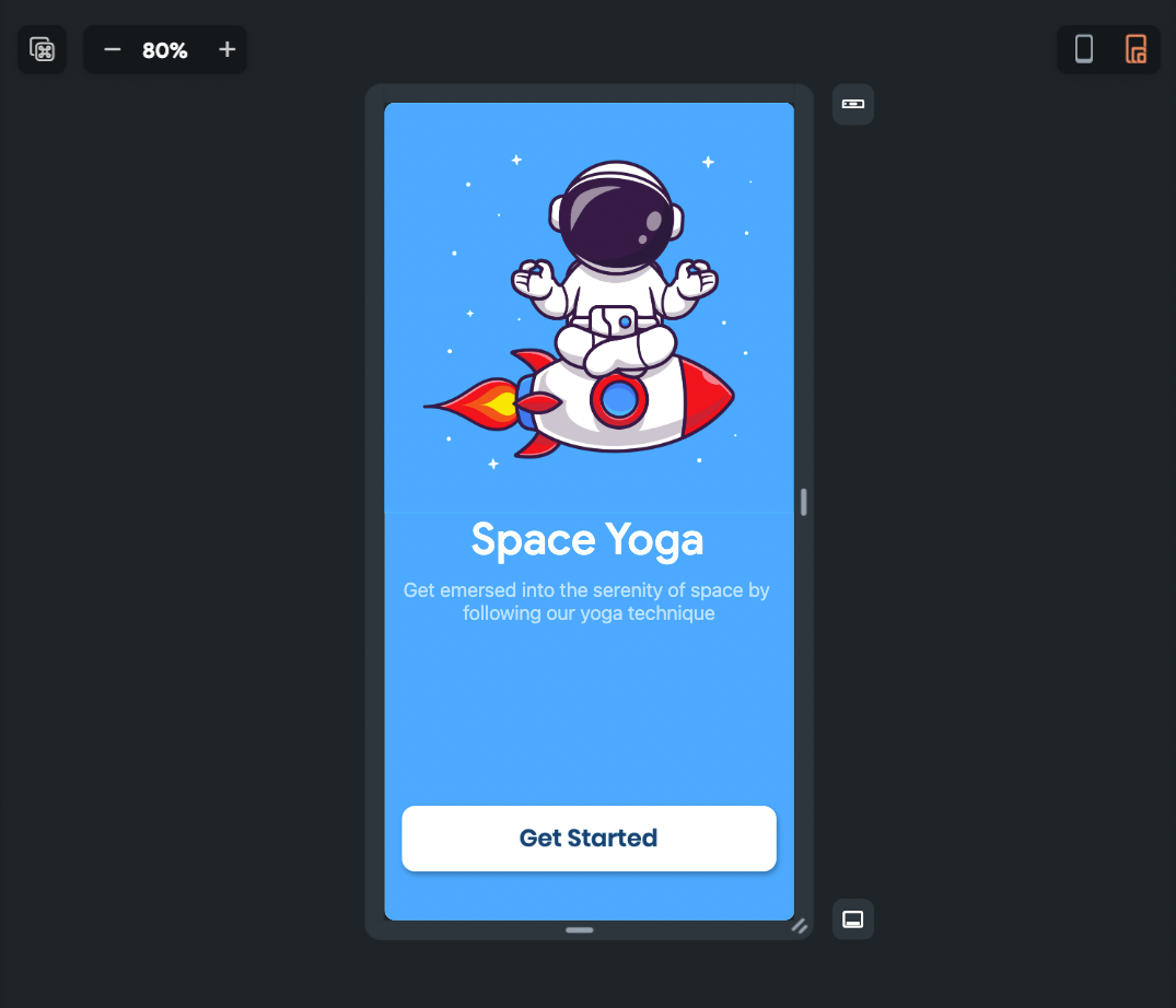
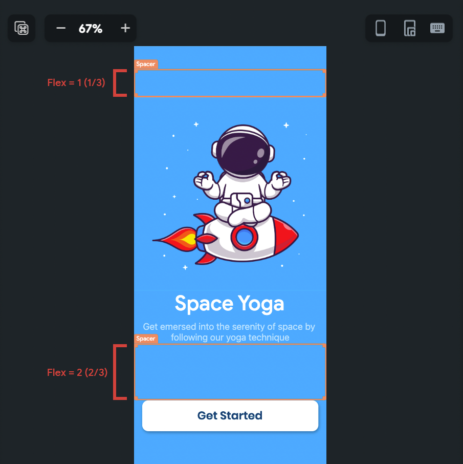
In the above SpaceYoga layout, the image and the texts seem to be pushed up to the top. It would look better if we add a bit of spacing on top of the image.
Add another Spacer widget and place it on top of the Image widget inside the Column.
Now, we want this Spacer to create less spacing than the one added above the Get Started button. So, let's assign a flex value of " 1 " to the top Spacer and a flex value of " 2 " to the bottom Spacer.
Notice that you have a smaller spacing on top (1/3 of the total space) and a wider spacing on the bottom (2/3 of the total space).
Conclusion
The techniques discussed in this article should help you design more adaptive layouts in FlutterFlow and prevent overflow issues. I hope you find this article helpful.
A summary of points to keep in mind while designing a layout:
- Remember to avoid a sizeable fixed value for height, width, or padding; this would help prevent layout overflows in most cases.
- Don't forget to take advantage of the Spacer widget while using a Column or Row.
- Using multiple expanded widgets inside a Row or Column, take the help of the flex value to divide the available space proportionally.
- Make the Column or Row scrollable if you think you have a lengthly layout that might overflow in some screen sizes.
- For displaying a long dynamic list, prefer the ListView widget.
References
- UI & Layout 101 - FlutterFlow Docs
- Column and Row widget - FlutterFlow Docs
- Spacer widget - FlutterFlow Docs
- ListView - FlutterFlow Docs