Animations play a crucial role in enhancing the user experience of an app. They add a touch of polish and make the app feel more interactive and engaging. However, it's important to strike a balance and avoid overwhelming the user with too many or overly complex animations.
In this article, we will dive into Animations 2.0 and explore how to add subtle, effective animations to your app's UI components. We'll focus specifically on Widget Animations. By the end of this article, you'll have a solid understanding of how to use Animations 2.0 to add that extra bit of flair to your app.
Behind the scenes
Before we get into the details of how you can use animations in your apps, let's take a closer look at the driving force behind Animations 2.0: the Flutter Animate package.
This package is a powerful tool that offers a wide range of prebuilt animations, as well as the ability to combine multiple animation effects to create visually stunning staggered animations. It's also highly performant, ensuring that your animations run smoothly and don't impact your app's overall performance.
This package has enabled us to unlock the following capabilities:
- Eight different animation effects (more about this in a bit)
- Ability to apply multiple combined animation effects
- Loop and reverse animations, or even boomerang them (loop + reverse)
- Animations can be triggered via new actions (start, stop, and reset)
It's possible to define all animation effects either as an "On Page Load" or "On Action Trigger" animation:
- On Page Load: Widget animations that automatically start once the page consisting it loads up.
- On Action Trigger: Widget animations that stay in the initial state when a page loads up but only start animating when triggered by an action.
We'll discuss about the animation actions/triggers in detail later in this article.
Applying animations
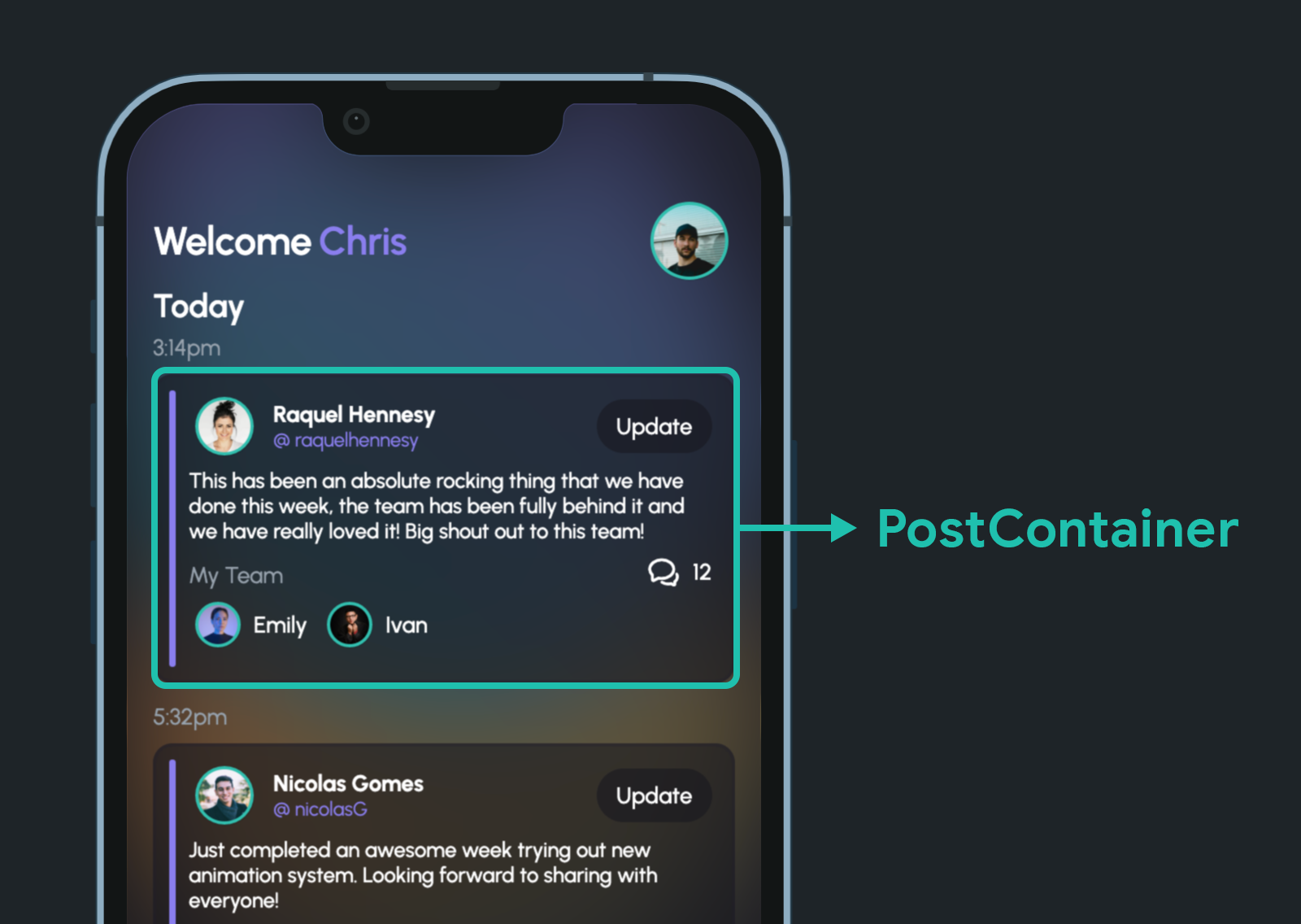
Defining animations in FlutterFlow is quite simple. We'll start with an existing UI of a home page feed showing posts created by team members.
Let's try adding a tilt animation to this PostContainer widget:
Follow these steps:
- Select the widget on which you want to apply the animation.
- From the Properties Panel, go to the Animations tab.
- Under On Page Load, click "Add Animation" button.
- Select the effect as Tilt.
- Keep the Duration as 600 milliseconds.
- Set the Final Horizontal Tilt to 0 degrees and the Initial Vertical Tilt to 30 degrees.
You can click on the Preview button to see the animation in action.
We have added the tilt effect as an On Page Load animation, so it will play automatically once the page is loaded.
Let's make this animation more attractive by combining some other effects!
- Keep the widget selected, and click "Add Animation" button.
- Choose the effect as Slide.
- When you combine effects, by default, FlutterFlow makes them staggered. This means the second effect will play once the first one has ended. That's why, on the second effect, you can see a delay equal to the duration of the first animation. But in this case, we want all the effects to be applied together. To achieve that, scroll above and enable the "Apply same duration & delay" toggle.
- Set the Initial Vertical Slide to 80 pixels.
- Add one more effect, Blur.
- Set the Initial Radius to 4 and the Final Radius to 0.
Click on the "Preview" button to see the combined effects in action:
Now that you know how to define animations inside FlutterFlow, let's get familiar with the different types of animation effects.
New Animation Effects
The new animation system offers most of the common effects and also includes some unique ones. There's a total of 8 effects supported by FlutterFlow, but you also have the ability to combine any of the animations together and generate an uncountable number of effects.
Let's start with the ones that most of you might already be familiar with.
- Fade Effect: Animates the opacity of the widget. The initial and final opacity values can range between
0.0to1.0. - Slide Effect: Animates the motion of a widget in a particular direction (including diagonally). The initial and final position values can range between
-∞to+∞pixels (it's even possible to push the widget out of the screen, so you need to be careful while defining the pixel values). One more thing to keep in mind, the position is calculated relative to the widget,0.0implying the actual position on screen along an axis. - Scale Effect: Animates the increase or decrease in the size of the widget. The initial and final scale values can range between
0.0to+∞,1.0being the actual size of the widget.
Now, moving on to the unique animation effects:
- Rotate Effect: Animates the rotation of a widget either to the left or right. The initial and final values can be defined in terms of the number of turns ranging between
-∞to+∞. Here,1.0turn is equivalent to 360 degrees where positive values indicate clockwise rotation and negative values indicate anti-clockwise rotation. - Shake Effect: Adds a shaking effect to a widget with defined
frequency,offsetandrotation angle. - Blur Effect: Adds an increasing or decreasing blur effect to a widget. The initial and final blur radius values can only be
positive. - Saturation Effect: Adds an increasing or decreasing saturation effect to a widget. The initial and final saturation values can be defined in terms of
percentages, where0%indicates fully de-saturated,100%indicates normal saturation, and100% +indicates over-saturated. - Tilt Effect: Adds a tilting effect to a widget. You can define initial and final values for both vertical or horizontal tilt in terms of
degrees, or use both to tilt diagonally.
Great going!
Now, you are familiar with all the new animation effects and know how to define animations. There's just one more step before you master the basics of animations inside FlutterFlow.
New Animation Actions
The animation actions come in handy when you don't want them to play as soon as the page loads but rather when a user interacts with a widget.
FlutterFlow provides three types of Widget Animation actions:
- Start Animation: Plays the animation defined on the chosen widget (if the animation has completed playing once, it will play again from the beginning). There are a few toggles that you can use to customize the animation playback, we'll take a look at them in a while.
- Stop Animation: Pauses a running animation. If the animation hasn't yet started playing or has already completed playing, this action won't have any effect.
- Reset Animation: Brings the animation playback to the starting point. This action is helpful if you are using loop or boomerang animation and want to reset the animation back to the starting point.
Follow these steps to define a Widget Animation action:
- Make sure you have defined an On Action Trigger animation on the widget.
- Select the button using which you want to trigger the animation.
- From the Properties Panel, go to the Actions tab.
- Click "Add Action" button.
- Select the action as Widget Animation.
- Choose the widget from the dropdown.
- Select the Animation Action Type as Start Animation.
Similarly, you can also use the Stop Animation and Reset Animation actions.
Let's have a look at the different toggles present under the Start Animation action:
- Enabling the Non Blocking toggle will allow the following action to trigger as soon as the animation starts. Otherwise, when this toggle is turned off, the next action will trigger only after the animation has completed playing.
- Resume Animation toggle is useful when you have stopped an animation before it has completed (can also be a looping or boomerang animation) and want to continue playing it. Instead, if you use Start Animation with Resume Animation
disabled, it will start the animation from the beginning even if it hasn't completed earlier.
enabled and the animation has completed playing once, this action won't have any effect.- Loop Animation toggle lets you keep the animation playing in a loop for an infinite duration. To stop a looping animation, you must explicitly use the Stop Animation action.
- Reverse Animation toggle lets you reverse the animation to its starting point after the animation has completed playing once in the forward direction (assuming the Loop Animation toggle is turned off). When the Loop Animation toggle is enabled, it will keep playing the animation as a boomerang effect.
Nice! With this we have covered the basics of Animation 2.0.
Now, it's time to put your freshly learned skills into action and create some fantastic animations inside FlutterFlow.
Though you have learned the basics, mastering animations require some practice and interating over and over to create new combined effects. To give you a head start, we have included a step-by-step guide for creating some not-so-simple animations.
Animated Activity Counter
You might have seen several apps using badges on top of icons to indicate the number of unread messages, a new update for an e-commerce order, or profile activity.
Just updating the counter value might work for some cases, but in most cases where you need to grab the user's attention quickly (while the person is busy inside the app), you would need some animation. This makes sure that you have a good UX inside your app and also does the job of grabbing the user's attention.
Today we'll create an animated profile activity counter – which might be helpful if you want to show the count of un-interacted actions inside the profile screen (it might be some critical privacy-related settings, a scheduled data backup that the user missed, etc.)
Let's start by building the UI:
For this demo, let's use a Local State variable to track the counter value (in practical apps, this value might be stored in Firestore or Supabase):
Next, define the required animations:
Finally, when a new activity arrives, we'll trigger the animation and update the counter value (for demonstration, we will add the actions on a floating action button):
Hover Animation
Apps targeted toward the web or desktop platforms should consist of a hover effect on the clickable UI elements. It's a subtle but one of the most important interactions that help improve your app's UX on the web/desktop.
Some Flutter widgets (like Button) have the hover effect built-in. But if you want to create a custom hover effect for a widget, Animations 2.0 helps you in implementing it.
Let's see how you can add the following hover effect to an Image widget.
Follows these steps to create the UI:
- Add a Container having a fill color (
#4C00CAFF), width [395pixels] & height [235pixels], and a border radius [20pixels] (this will act as the border of the image when the mouse is hovering). - Wrap the Container with a Stack widget. Set the Default Child Horizontal and Vertical Alignment to
0. - Add another Container inside the Stack (below the previous container in the widget tree) with lesser width [
380pixels] and height [220pixels] than the previous Container, and a border radius [12pixels]. Set a Background Image and a Box Shadow.
Define the required On Action Trigger animations:
- On the BorderContainer, add a Scale + Fade effect with the same duration [
300milliseconds]. - On the ImageContainer, add a Scale effect with the same duration as the BorderContainer.
Capture mouse hover interaction and trigger the animation:
- Wrap the Stack with a MouseRegion widget.
- Define actions on the MouseRegion widget to trigger the animations. On Mouse Enter, start the animations and set both to Non Blocking. On Mouse Exit, start the animations with Non Blocking, Resume and Reverse toggle enabled.
Text Reveal Animation
Text reveal animation is a popular technique used to gradually reveal text on a screen. It can be used to add visual interest and emphasis to text within an app, and create a sense of suspense or surprise. This type of animation can be used in a variety of situations, and is effective in drawing attention and adding excitement to the content being presented.
Let's learn to build the following text reveal animation inside FlutterFlow:
The secret sauce for achieving this animation is having a hidden Container widget (same color as the background) on top of the Text widget, both of them wrapped inside a Stack. We would be sliding the Container away, revealing the Text.
The UI can be created like this:
You can name the hidden containers as HiddenTitleContainer and HiddenSubtitleContainer.
Define animations on the Containers:
Trigger the animations using actions:
Here, the animations are declared as On Action Trigger animations, but you can follow similar steps to declare them as On Page Load animations without needing to define the actions (you would need to add a delay before the second animation if you want it to start after the first one completes).
Like Button Animation
This is another common animation that helps you improve your app's UX. You can use this like button animation in social apps, food delivery apps, e-commerce apps, and many more.
Creating this animation is a bit more complex and involves more steps than the earlier ones. But it uses the similar concepts that you learned in the previous ones.
I'll leave this as a challenge for you to implement 😉.
Built by our community
During our #FlutterFlowTurns2 Design Contest, we had some incredible submissions by the users. Some of which we didn't even expect it was possible to create inside FlutterFlow – but we were amazed by the submissions! And the duration of this Design Contest was just one week!
Animations 2.0 was a significant part of most of these projects, make sure you take a look at them!
You will find some of the Design Contest projects on the FlutterFlow Marketplace.
Conclusion
We have just touched the tip of the iceberg in this article. There are an infinite number of possibilities using Animations 2.0, it only requires more exploration!
Everything we have covered or built in this article are available in this Clonable Project (including the Like Button animation 💜).
Feel free to share your FlutterFlow app animations on Twitter (by tagging @flutterflow) and LinkedIn (FlutterFlow) with the hashtag #builtwithflutterflow.