Typically, a Floating Action Button (FAB) is used to perform a single action (for example, creating a post). But sometimes, it might be a better UX to show some sub-actions when the FAB is clicked. That helps prevent unnecessary navigation to a separate page just for choosing that sub-action.
In this article, we will build an Animated Expandable Button using FlutterFlow with the help of Animations 2.0.
Basic user interface
Let's start from scratch by creating a new Blank App inside FlutterFlow.
For this demo:
- Just name the project as "Expandable Button Demo".
- Click Create New under Blank App.
- Disable Firebase and click Start Building.
- By default Home Page is created, remove the AppBar and set a background color to the Scaffold.
Most probably, you will be having a page with some content, and you would want to show the button on top of it (in the bottom right corner) – just as the FAB shows up.
We won't be creating a whole page (as it's not the focus of this tutorial), so we will just use a Container assumed to be the page for this demo.
Options UI
Follow these steps for building the user interface to display the options when the expandable button is tapped:
- Wrap the page (i.e., the Container in this case) with a Stack widget.
- Set the Default Child Horizontal Alignment and Default Child Vertical Alignment to
1.
- Set the Default Child Horizontal Alignment and Default Child Vertical Alignment to
- Add a Column inside the Stack (make sure it's below the Container in the Widget Tree, which means it will be on top of the Container in the UI).
- Add a padding of
16pixels to the right and bottom of it. - Set the Main Axis Size to minimum.
- Add a padding of
- Add a Container inside the Column.
- Set the width to
200pixels and the height to300pixels (after adding some content inside the Container you can remove the height to let the Container take up only the space required by the content). - Add a subtle border radius of
10pixels on all sides. - Enable the Clip Content toggle (to prevent any corner of the content to overflow from the border radius).
- Name this Container as "OptionsContainer".
- Set the width to
- Add a Column inside it.
- Set a padding of
8pixels from the top and the bottom.
- Set a padding of
- Add another Container inside this Column.
- Set the width to
infand height to50pixels.
- Set the width to
- Add a Row.
- Set a padding of
20pixels from the left and right. - Add an icon and a text for this option.
- Set a padding of
- Repeat steps 7 and 8 for adding the rest of the options.
Expandable Button UI
To create the UI for the expandable button, follow these steps:
- Add a Container to the parent Column.
- Make it Circular Shape.
- Set the diameter to
50pixels. - Enable Clip Content.
- Enable gradient, set the angle to
30degrees, and assign two different colors. - Add a padding of
8pixels on the top.
- Make the parent Column's cross axis alignment to End.
- Add a Stack inside the Container.
- Make the Default Child Horizontal Alignment and Default Child Vertical Alignment to
0.
- Make the Default Child Horizontal Alignment and Default Child Vertical Alignment to
- Add an Icon for
send(modify the color as per your design).- Add a tiny padding of
5pixels to the left.
- Add a tiny padding of
- Wrap the Icon with a Transform widget. Keep the transform type as Rotate and set it to
-45degrees. - Add another Icon inside the Stack for
close.
This completes our basic design of the expandable button. Next comes the fun part, animating the icon transitions and the options.
Icon transition animation
In the previous step, we added a send and a close icon. Now, it's time to animate them so that:
- When send is clicked (the panel with options show up) the icon transitions to close, and
- When close is clicked (options panel closes) the icon transitions to send.
Follow these steps to create the icon transition animation:
- Select the Transform widget wrapping the send icon.
- From the Properties Panel, go to the Animations tab. Select the On Action Trigger tab.
- Add a Slide effect.
- Set the final position of Horizontal Slide to
30pixels and the final position of Vertical Slide to-30pixels.
- Set the final position of Horizontal Slide to
- Select the close icon.
- Go to the Properties Panel, select the Animations tab > On Action Trigger.
- Add a Fade effect.
- Set the Initial Opacity to
0and Final Opacity to1.
- Set the Initial Opacity to
- Enable the Apply same duration & delay toggle. Keep the duration as
600milliseconds but set the delay to300milliseconds. - Add a Scale effect.
- Set the Initial Scale to
0and Final Scale to1.
- Set the Initial Scale to
We would want the transition to happen only when the button is clicked. So, we need to add actions on the button to start the animations. But before that, add a Local State variable of boolean type called isOptionsExpanded to keep track of whether the options panel is expanded.
To define the actions required for starting animations, follow these steps:
- Select the ExpandedFAB Container.
- From the Properties Panel, go to the Actions tab. Click Open beside the Action Flow Editor.
- Add a Conditional Action and set it from the local state variable
isOptionsExpanded. - Under the FALSE branch:
- Add a Widget Animation action. Choose the widget as SendIcon. Keep the type as Start Animation and make it non-blocking.
- Similarly, add another Widget Animation action but for the CloseIcon.
- Add an Update Local State action. Choose the field as
isOptionsExpandedand set it to Specific Value > True. Set the update type to No Rebuild.
- Under the TRUE branch:
- Add a Widget Animation action. Choose the widget as SendIcon. Change the type to Reverse Animation and make it non-blocking.
- Similarly, add the reverse animation action for the CloseIcon.
- Add an Update Local State action. Choose the field as
isOptionsExpandedand set it to Specific Value > False. Set the update type to No Rebuild.
- You are done with defining actions. Click Close on the Action Flow Editor.
Animating options
The next step is animating the options along with the Container inside which they are present, this will help to create a very smooth open/close transition.
Follow these steps:
- Select the
OptionsContainerwidget. - From the Properties Panel, go to the Animations tab. Select the On Action Trigger tab.
- Add a Fade effect.
- Set the duration to
500milliseconds.
- Set the duration to
- Select an option
Container. - Define the following animations on it:
- Add Slide effect with Initial Horizontal Slide position as
-20pixels. - Enable the Apply same duration & delay toggle.
- Add a Fade effect with default properties.
- Add Slide effect with Initial Horizontal Slide position as
- You can copy these animations using "Copy All Animations" option. Select the next option
Containerand paste these animations.- Enable the Apply same duration & delay toggle.
- Add a delay of
+200on top of the previous one (this will make the options have a staggered animation effect). - Repeat this step for the other options as well.
We need to trigger these animations when the Expandable FAB button is tapped, so we can update the actions defined on the button to also include these Start Animation or Reverse Animation actions under the FALSE or TRUE branch of the condition.
Defining actions on options
The only thing left to do is, when each of these options are tapped, we need to perform an action. This can be any action, but for simplicity, we will navigate the user to a different page based on the option tapped.
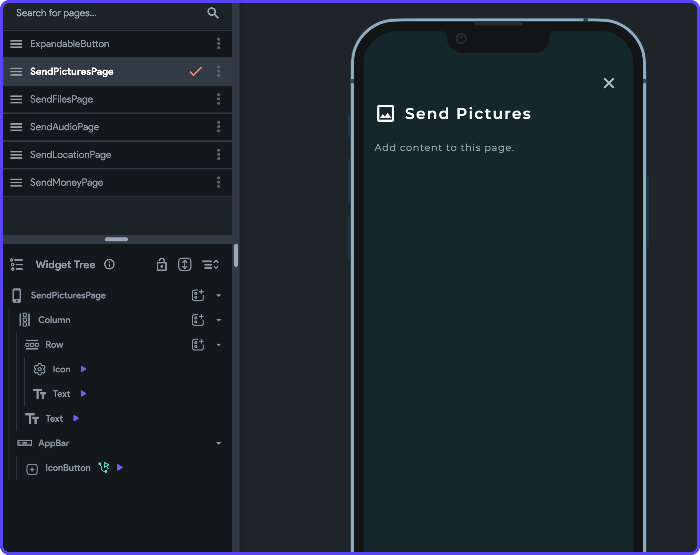
I have already created some simple pages (one for each of the options):
Now, you can just define a Navigate action on each of the options to take the user to the correct page.
Conclusion
Awesome! 🥳 We have completed building this nicely animated expandable floating action button. Here, we have used it as an expandable send button, but you can use similar concepts to create an expandable button suitable to your use case.
Here's how it looks in action:
You can get the clonable version of this project here.
References
You can check out the following pages for more information regarding the concepts used in this blog post: